Rudexgrow
A full-stack brand launch for a video editing agency trying to go global. I started with a name and a handful of their work samples. Four weeks later they had a live identity, a premium website, and clients actually replying to their cold outreach.

A video editing agency with no logo, no copy, no colors, and no presence — built into a fully launched premium brand in four weeks
RudeXGrow is a video editing agency that had been operating locally with decent output but zero digital footprint. When they decided to go global and start reaching clients online, they ran into the wall that every bootstrapped creative agency hits: no one trusts a name they can't look up.
I was brought in as a freelancer, but the scope turned out to be much larger than "build a website." The agency had no logo, no brand colors, no organized service list, and no written content of any kind — just a name and a folder of sample videos. My job was to build an entire brand identity and online presence from scratch within four weeks, continuously taking the client's feedback and iterating at every stage.
This case study covers the full process: how I approached brand-building without a brief, how I solved the content problem for a service catalog too large for any client to finish reading, the interaction and animation decisions that drove the premium feel, and what I'd do differently if I started today.
A saturated market, zero digital presence, and a service catalog so long that no client had ever finished reading it
The agency was sending cold outreach with nothing behind the name — no website, no logo, no organized presence — and getting zero replies. Potential clients in a saturated market had no reason to trust them over the dozens of other agencies showing up in their inbox.
The core problems were layered:
- No online presence — cold outreach was going unanswered because there was nothing for prospects to verify the agency against
- No brand identity — no logo, no colors, no visual language; the agency looked like it didn't exist
- Unstructured service catalog — the agency offered a large number of services but couldn't communicate them coherently; a 5–6 page PDF had been attempted, and no client ever finished reading it
- No copywriting whatsoever — not a tagline, not a service description, nothing; every word on the site had to be written from scratch
- High competitive pressure — video editing is a crowded space where competitors are often well-designed and well-presented; there was no room for "good enough"
The problem wasn't just technical. It was brand-level — the agency simply didn't exist in any communicable form to the outside world.
Build something premium enough that a cold prospect landing on it for the first time immediately trusts the agency
Primary goal: Build a brand identity and landing page that makes RudeXGrow feel premium, trustworthy, and immediately credible — the kind of site that turns cold outreach into actual replies.
Definition of Done
The project was complete when all of the following were true:
- ✓ A live logo and coherent brand identity — color system, typography, visual language
- ✓ Three complete pages: Home (with Services + Work anchor sections), About, Contact
- ✓ All content written, revised, and client-approved — zero placeholder copy
- ✓ A visitor can understand the full scope of services without feeling overwhelmed
- ✓ The site creates the clear feeling that this is a premium, capable agency
- ✓ Fully deployed: custom domain, domain email, Google Search Console, and analytics live
Stretch Goal
- ✓ Cal.com integration — not strictly required, but I pushed for it; it eliminates the manual overhead of appointment scheduling and is now standard practice for modern agencies
Every item above was treated as a hard requirement. The stretch goal made the final cut.
A lean, deliberate stack chosen for shipping speed, motion quality, and long-term maintainability on a solo timeline
Frontend
- Next.js (App Router) — framework and routing
- Tailwind CSS — utility-first styling
- Framer Motion — all animations: entrance, route transitions, micro-interactions
Design
- Figma — rough skeleton layouts and services section iterations
Integrations
- Cal.com — automated appointment scheduling
- Google Search Console — search visibility and indexing
- Vercel Web Analytics — basic visitor tracking
Infra & Deploy
- Vercel — hosting and deployment pipeline
- Custom Domain — brand-matched domain
- Domain Email — professional email address on the agency's domain
The entire stack was chosen to keep the feedback loop tight — write, see it live, iterate — without needing a second person in the room.
One full day of surfing competitors set the visual bar and surfaced the four design decisions that shaped everything that followed
Before touching Figma or writing a line of code, I spent a full day doing pure research — going through Behance, Dribbble, and Pinterest, plus live competitor agency websites. The goal was to build a clear picture of what the space looked like and where the bar was set.
Four things came out of that day that directly shaped every design decision that followed:
- Hero sections with video — every top-tier agency in the space was leading with video in the hero; it was non-negotiable for a video editing agency
- Sticky primary CTA — the best-converting sites kept their main call-to-action visible regardless of scroll depth
- The Work Process section matters more than most things — sophisticated agencies were putting real effort into visualizing how they work; it was a trust signal, not a filler section
- FAQ as a conversion tool — in this domain specifically, FAQ sections weren't decorative; they were detailed, honest, and clearly written to address the hesitations of an actual potential client
That full day of surfing gave me a taste calibration I could rely on for the rest of the project. It replaced the need for detailed wireframe ideation on most sections — the layout logic was clear in my head before I opened Figma.
Brand foundations first, content second, code last — because an animation in the wrong color palette is still wrong
The hardest planning problem wasn't the page layout — it was the content. Before writing a single line of code, I had to figure out how to turn a 5–6 page service catalog into something a visitor could parse in one smooth scroll. I used Figma to sketch a rough skeleton for the services section specifically, running a few iterations to filter out approaches that would have collapsed into an info dump.
For content, I made a deliberate choice to write section-by-section and get client feedback per section rather than producing the full copy in one pass. Asking a client to review an entire page of content at once produces low-quality feedback — it's too much to hold in their head. Writing in pieces meant the feedback was specific and honest.
Brand foundations were locked in before any layout work — color first, then the logo, then typography. These were load-bearing decisions: everything visual downstream depended on them being right.
Component Architecture
Every page was broken into sections. Any UI component appearing across multiple sections — layout containers, cards, chip elements, section headers — was made global and reusable. Page-specific logic stayed colocated with the page. The organizing principle was feature-based with page scoping: each page had its own directory, sections were colocated inside it, and shared components lived at the root.
Brand Foundation Decisions
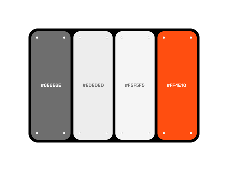
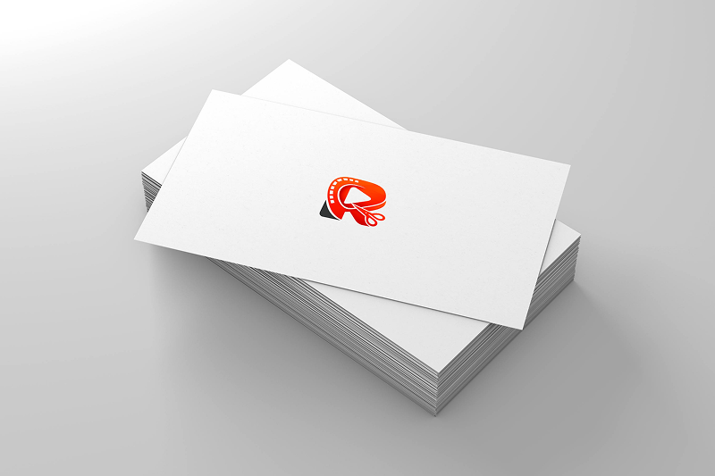
The brand color #ff4e10 was chosen because it sits in the same visual family as YouTube, Instagram Reels, and standard video player UI — it reads as "video" instantly without being a direct lift. Catchy and saturated, it reads as premium at scale.
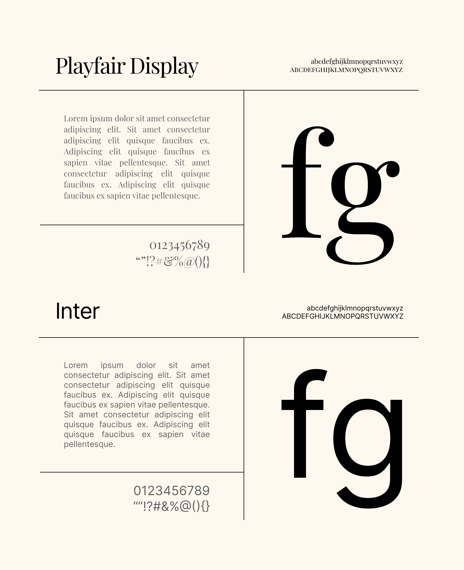
For typography, I paired Inter with Playfair Display — Inter for its versatility and neutrality as a body/UI font; Playfair Display for the serif contrast that gives the site a premium editorial feel without feeling dated. The contrast between a clean grotesque and a structured serif was the right tension for a brand that needed to feel both modern and trustworthy.
Three ideas were seriously considered for the Work Process section — two were discarded before the right one became obvious
The Logo
The client wanted the agency name's initial — "R" — in the icon, which is also a current trend in modern logomarks. My constraint was to make it feel native to the video editing domain without being generic. I explored merging video-adjacent elements — a play button, a film reel, scissors (the universal symbol for editing cuts) — and morphing them into the letterform.
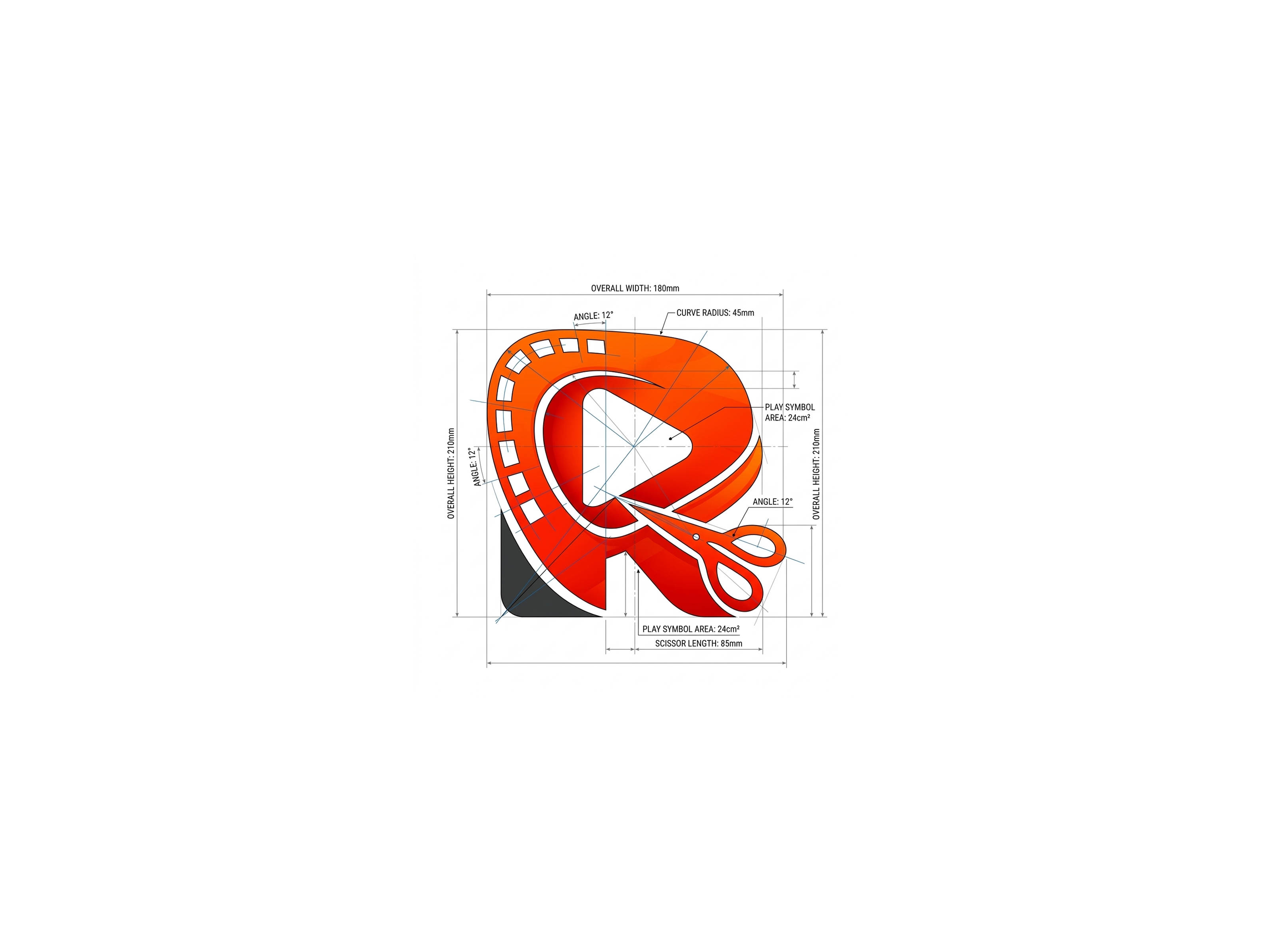
The final logo reads as "R" immediately, but a closer look reveals the video elements embedded in it. The brand color carried through the entire mark. It passed client approval in the first iteration, which told me the direction was right.
Work Process Section — The Ideation
This section demanded the most thinking. I knew from research that it was critical — so I explored every realistic option before committing:
- ✗ Video explainer — ruled out immediately; who watches it, who produces it, and it's entirely dependent on variables outside my control
- ✗ Step-by-step text list — worth considering, but flat; minimizing text load was a site-wide goal and a full text process list would have worked against it
- ✗ Text + static illustration — good, but not good enough; above-average wasn't the target
- ✓ Text + animated illustration — three steps, three custom animations; each one showing the step rather than describing it
The animations: a live Google Meet call for "connect with client," a hand dragging files into a media input for "share your assets," and a live chat exchange for "review and iterate." Each animation was self-explanatory — the accompanying text became secondary context, not the primary communication.
Contact Page Layout
A traditional contact form felt wrong at this scale — it adds a manual layer of inbox management. I pushed for Cal.com as the more professional, automated alternative. But the contact options themselves were sparse: email, WhatsApp, Telegram, and Cal.com. Representing four items on a page without it looking thin required deliberate layout thinking.
A bento-style card layout solved it — each channel got its own card with priority signals built into the design. The email card was the largest, carrying a prominent Gmail icon with chips reading "fast replies" and "main channel" to communicate hierarchy visually, not through a footnote.
Every major decision had a real trade-off — here's what was chosen, what was considered, and the one-sentence reason why
Framework
- Chosen: Next.js + Tailwind CSS
- Considered: No serious alternatives
- Next.js + Tailwind is the current standard for shipping landing pages fast without sacrificing quality. No runway to experiment on a 4-week timeline.
Animation Library
- Chosen: Framer Motion
- Considered: GSAP
- Framer Motion is lightweight, has a natural React API, and is easier to maintain solo — GSAP is more powerful but overkill for this scope.
Route Transitions
- Chosen: View Transition API
- Considered: Custom Framer Motion page transitions
- The View Transition API handled forward navigation cleanly and kept the premium feel intact — pop-state transitions remain a known gap, but it was the right tradeoff for the timeline.
Appointment Scheduling
- Chosen: Cal.com
- Considered: Traditional contact form
- A form requires manual triage; Cal.com automates the entire scheduling flow — no inbox management, no back-and-forth, and it signals professionalism immediately.
Work Section Layout
- Chosen: 3-column infinite parallax scroll with alternating directions
- Considered: Standard grid, dedicated Work page
- The client had fewer than 12 sample videos — not enough for a dedicated page without looking sparse. The parallax approach looped the videos across three alternating columns, creating an abundance effect that made a small library feel overwhelming in the best possible way.
Every one of these decisions had consequences that showed up later in the build — particularly the animation and route transition choices, which fed directly into the biggest retrospective lessons.
A 3-page premium landing page with full brand identity, motion design, original copy, and complete deployment — built from zero assets in four weeks
The site is organized across three pages — Home (hero, services, work, work process, and FAQ sections), About, and Contact. Every page carries entrance animations on scroll, route transition animations between pages, and micro-interactions on interactive elements. The aesthetic is deliberately light, branded, and premium — not because it was trendy, but because it matched what video editing agency clients actually respond to.
Core Deliverables
- Brand logo with embedded video-domain iconography — play button, film reel, scissors morphed into the letterform "R"
- Brand color system anchored by
#ff4e10— native to the video industry's visual vocabulary - Home page — Services bento layout, 3-column parallax Work section, animated Work Process, conversion-focused FAQ
- About page — agency identity, positioning, and story
- Contact page — bento card layout with Cal.com booking integration
- Full deployment stack — Vercel, custom domain, domain email, Google Search Console, analytics
The result is a site that communicates the agency's full scope of services, builds immediate trust, and converts cold outreach from ignored to replied-to — which is exactly what it was built to do.
Upfront requirements gathering kept iterations minimal — when changes came, they were content-specific, not structural
Because I took requirements thoroughly upfront and wrote content section-by-section with client sign-off at each stage, the overall iteration count stayed low. Changes were content-specific rather than structural — a sign that the planning process worked.
Services Section — v1 → v2
The initial structure grouped the agency's services into broad categories. After review, the client specifically requested that Brand Ad Services and Real Estate Marketing Video Editing be called out as standalone subsections. These were already implied by the broader service descriptions, but the client wanted explicit mentions.
I integrated both without adding text weight — kept them scannable within the existing layout by using the established bento pattern rather than adding new copy blocks.
FAQ Section — v1 → v2
One round of content-level revisions. The structure and layout were approved immediately — the iteration was purely about refining the question framing and answer depth to better reflect the actual hesitations of a video editing agency's potential client. This is what FAQ sections in this domain are for, and getting the wording right mattered.
The minimal iteration count wasn't luck — it was the direct result of section-by-section client review, which produced focused feedback instead of vague reactions to a wall of finished copy.
Seven sections, three pages, one coherent system — each piece built to serve a specific role in the visitor's journey
Hero Section
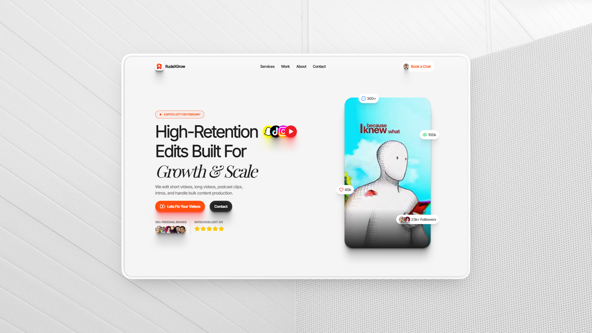
Conversion Focused Heading, agency positioning statement, clear CTAs and a set of videos in a portrait frame getting changed by scrolling up every 2-3 seconds . Sets the visual tone for the entire site immediately.
Validated by competitor research as non-negotiable for a video editing agency.
Services Section
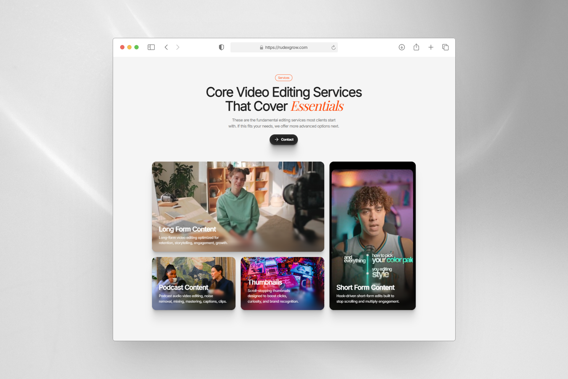
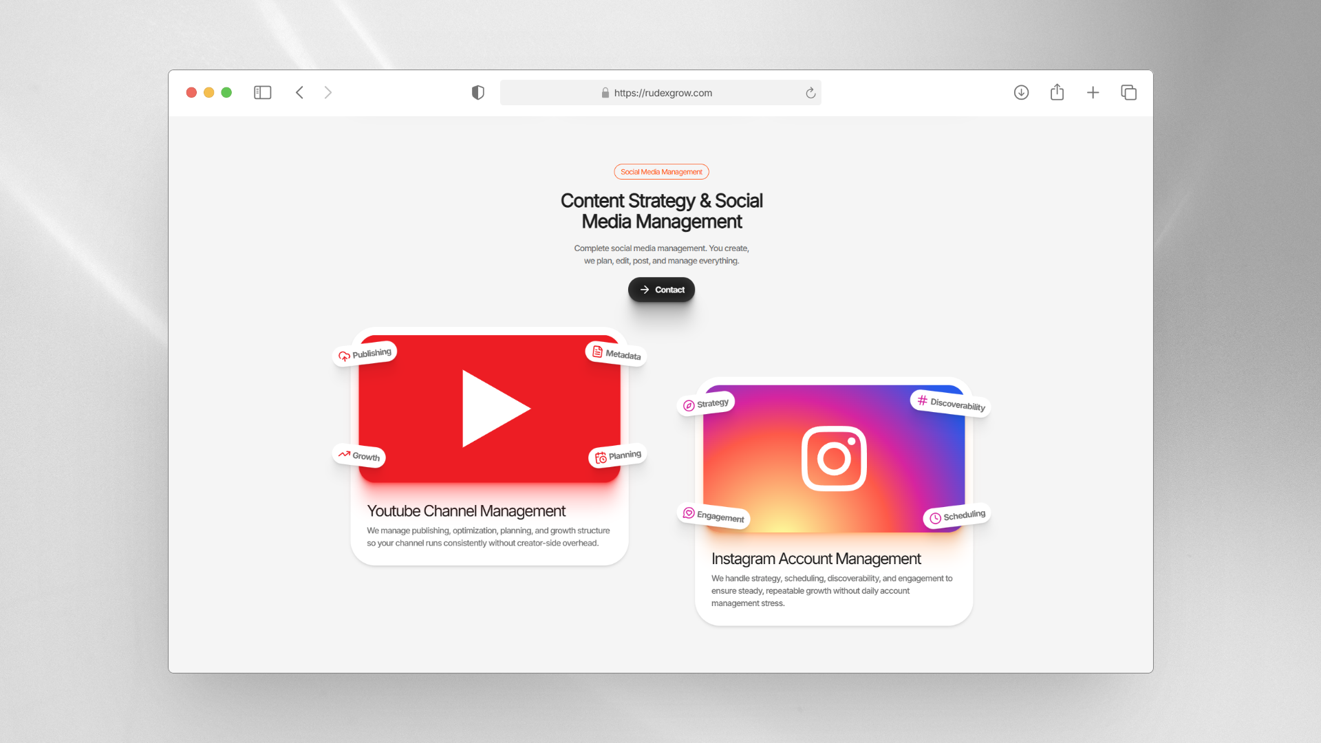
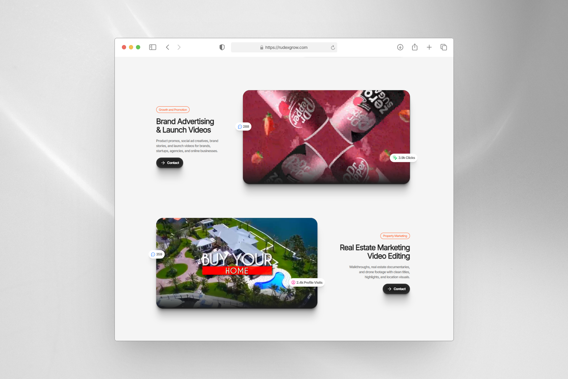
Translates a 5–6 page service PDF into a single, scannable section. Primary services are presented in a bento layout with expandable detail. Secondary services are grouped in a contrasting subsection with deliberate negative space providing visual breathing room between layouts. Social proof chips and media-text contrast prevent the section from reading as an info dump.
The hardest section to build — required distinct layout strategies per subsection to sustain visual interest across the full scroll.
Work Section — Parallax
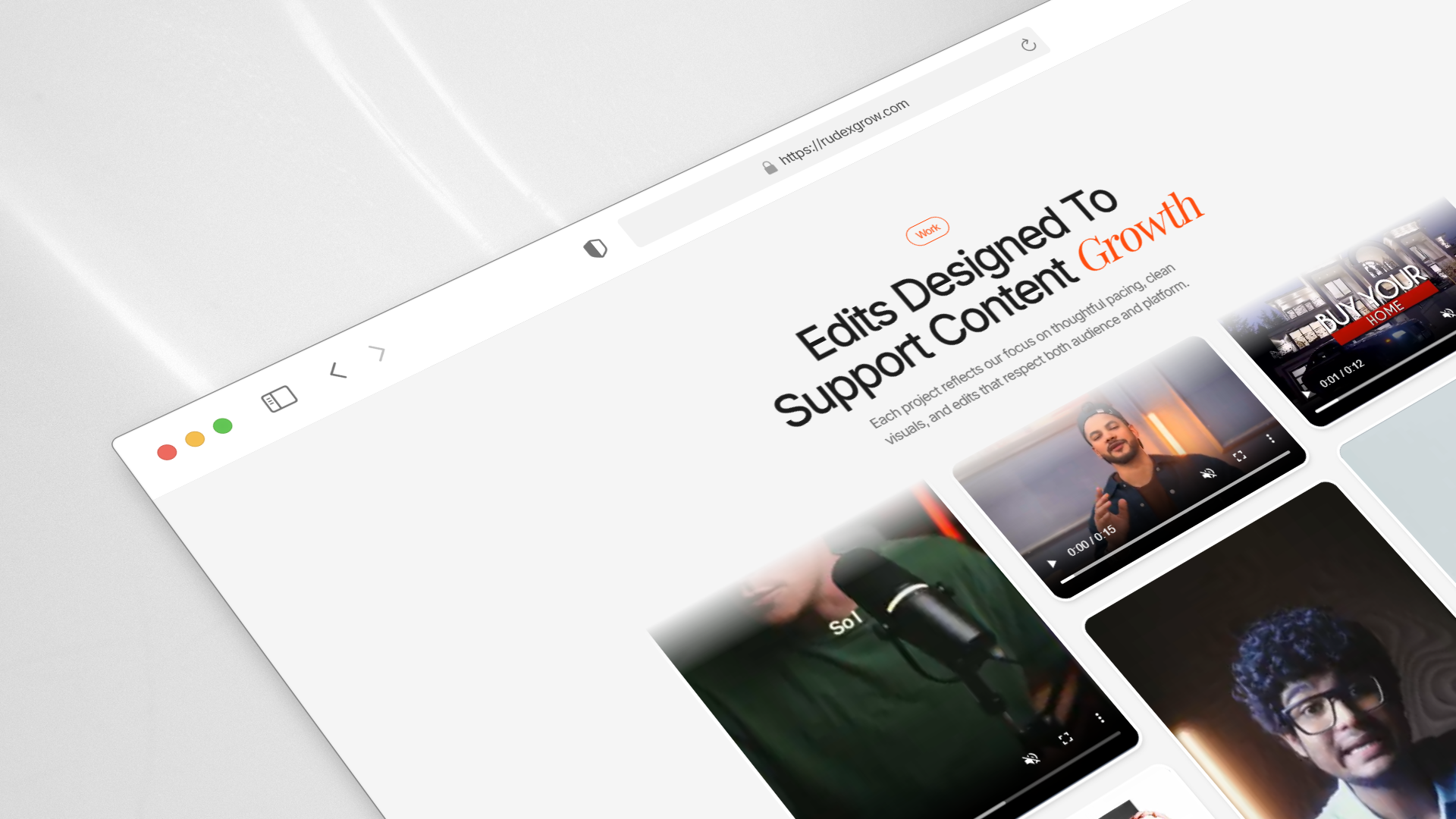
Three columns of video thumbnails that scroll in alternating directions (up/down per column) when the section locks into view. Each column loops its videos infinitely. With fewer than 12 total videos, this creates the visual perception of a massive, active portfolio.
Purpose-built to solve a real constraint: making a small video library feel abundant.
Work Process Section
Three-step process visualized entirely through custom animations — no text-heavy explanations needed:
- Step 1: A live Google Meet call in progress — connect with client
- Step 2: A hand dragging files into a media input — share your assets
- Step 3: A live chat conversation — review and iterate
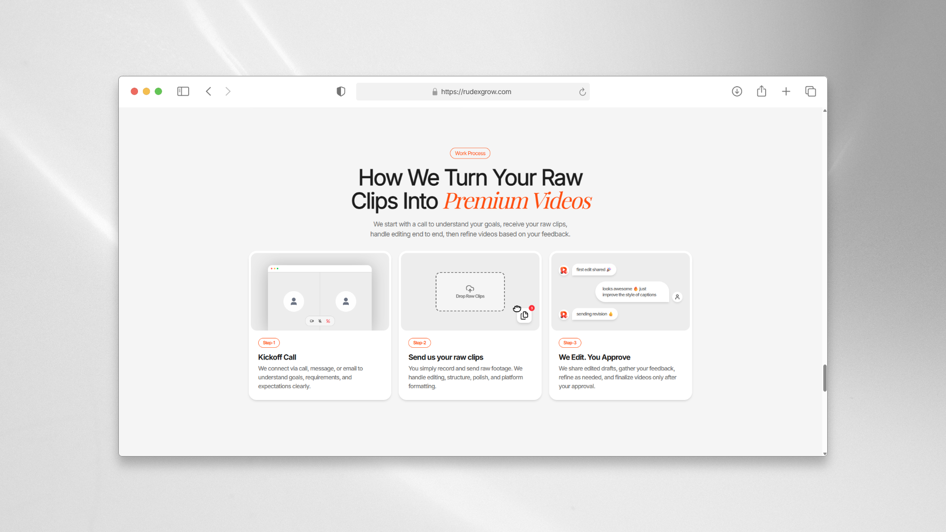
Each animation is self-explanatory. The accompanying text is secondary context, not the primary communication.
FAQ Section
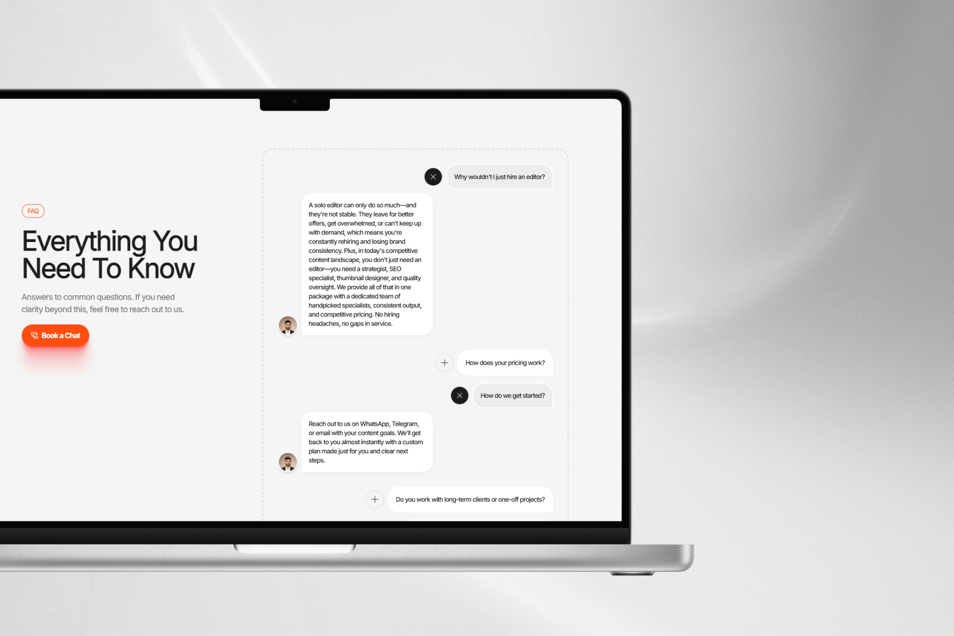
Strategically written to address the real hesitations of a video editing agency's potential client. Questions and answers were researched, drafted, and revised for organic language — not AI-generated filler. This section was treated as a conversion layer, not decoration. Research showed FAQ sections in this domain are actually read — so they were written accordingly.
About Page
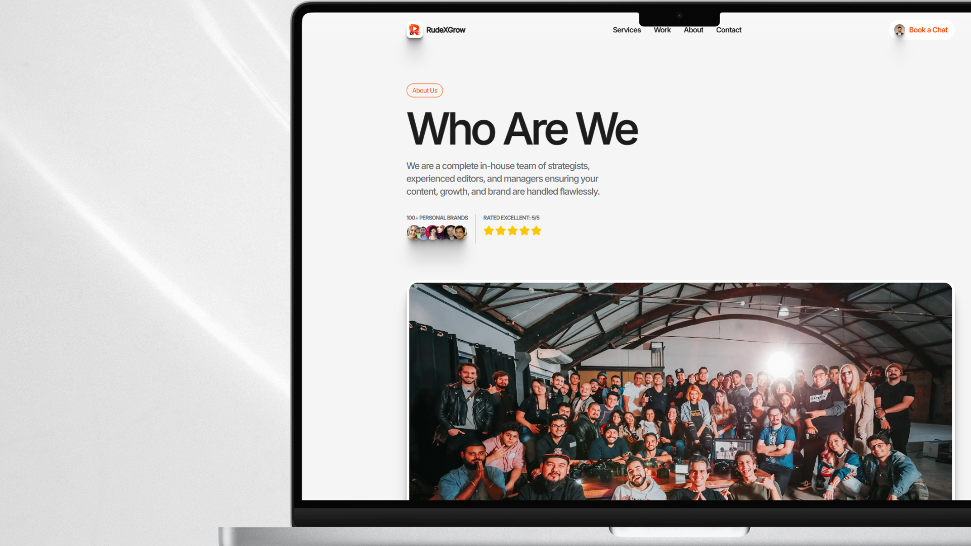
Communicates the agency's identity, positioning, and story. Consistent animation system carried through from the home page — no jarring tonal shift between pages.
Contact Page
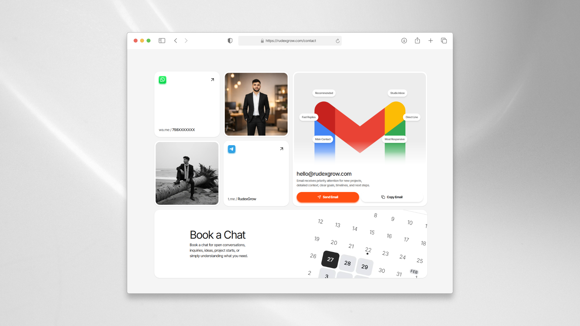
Four contact channels — email, WhatsApp, Telegram, Cal.com — presented in a bento card layout. The email card is the largest, with priority-signal chips ("fast replies," "main channel") communicating channel hierarchy visually. Cal.com integration handles appointment booking without any manual scheduling overhead.
Bento layout solved the "sparse data on a full page" problem without padding it with unnecessary copy.
150 visitors, 450+ page views, and cold outreach finally getting replies — all in the first week after launch
The numbers from the first week told a clear story:
- 150+ visitors in the first 7 days post-launch
- 450+ page views in the same period — a 3:1 page-view-to-visitor ratio
- 3 pages per visit on average — visitors weren't bouncing; they were navigating
The 3:1 ratio is the most meaningful metric here. It means visitors were stopping on the site and actively moving through pages — exactly the behavior that signals trust being built in real time.
Beyond the analytics, the qualitative outcomes were equally direct: cold outreach that previously received zero replies started generating real responses after the site launched. The client reported that their community specifically noted the site looked premium and professional — and that attaching the site link to outreach messages had meaningfully changed prospect behavior.
Those aren't vanity metrics. That's the brand problem getting solved.
Three hard problems — one about content density, one about asset scarcity, and one about a browser API that wasn't ready
Services Section: Condensing a PDF Into One Scroll
Translating a 5–6 page service catalog into a single, non-overwhelming section was the hardest design-engineering problem on this project. It wasn't just a content challenge — it required:
- Different layout strategies per subsection to prevent visual monotony
- Deliberate negative space to give the section breathing room
- Continuous injection of visual variety — bento grids, social chips, media-text contrast — to keep the visitor's attention without overwhelming them
The solution worked: all services are scannable in one smooth scroll. Nothing was lost; it was reorganized and compressed through layout rather than by cutting content.
Work Section: Making 12 Videos Feel Like a Catalog
I wanted to build a dedicated Work page, but the client had fewer than 12 sample videos — not enough to fill a page without looking thin and unconvincing. I solved it with the 3-column alternating parallax loop, which creates an abundance effect that makes a handful of videos feel like an extensive, active portfolio.
It worked so well that the dedicated Work page no longer feels necessary at this stage. The constraint became the feature.
Route Transitions: Pop-State Remains Unsolved
I implemented route transitions using the View Transition API, which handled forward navigation cleanly. But pop-state transitions — browser back and forward — remained unsolved within the 4-week timeline. The Next.js App Router makes this a non-trivial problem, and I didn't have the runway to work through it properly.
It was a conscious decision to ship without it rather than delay. The overall premium feel wasn't compromised — but it's the one motion feature I'd go back for.
Three things this project taught me that I didn't fully understand before I started building it
Design Through Code — When to Trust Your Instincts
The typical "design fully in Figma, then build" workflow is built for teams with dedicated designers. Working solo on a tight timeline, I learned to trust designing in the browser for small components. If you've surfed enough good work to build a real taste, your instincts during implementation are reliable.
Figma stays essential for complex layout problems and major sections — but not for every single element. If you have to open a design tool to decide the padding on a chip component, you've over-processed your workflow.
View Transition API — A Fair Trade-Off
This project was my real hands-on exposure to the View Transition API for route transitions in Next.js App Router. It's not a perfect solution — pop-state is a known gap — but for forward navigation on a project like this, it delivers the premium feel without the complexity of building a custom Framer Motion page transition system from scratch.
The trade-off was worth it for the timeline. Knowing exactly where it breaks makes me better equipped to handle it properly next time.
Minimalism as an Abundance Strategy
The contact page, the work section layout, the negative space around service subsections — this project taught me to exploit minimalism not as a style preference but as a communication tool. Less visual noise doesn't mean less information. It means the information that is there lands harder.
The bento layout on the contact page made four contact options feel considered and complete. A dense form would have made the same four options feel buried.
Every primary goal was met — the one open deliverable was blocked by a client constraint, not a build failure
Looking back at the goals set at the start of the project:
- ✓ Live logo and coherent brand identity
- ✓ Three complete pages with all anchor sections
- ✓ All content written, revised, and client-approved
- ✓ Visitor can parse the full service scope without feeling overwhelmed
- ✓ Site creates immediate premium, credible feeling
- ✓ Full deployment stack live — domain, email, Search Console, analytics
- ✓ Cal.com integration shipped (stretch goal)
- ✗ Dedicated Work page — blocked by insufficient client video assets at launch time
Overall goal fulfillment: ~95%.
The 5% is the Work page — and it's a scope deferral, not a failure. The parallax work section on the home page handled the function so effectively that the dedicated page is no longer urgently needed. When the client has enough video samples, it'll be built. Until then, the current solution does the job.
Cold outreach is getting replies. Visitors are staying and navigating. The client's community is calling the site premium. That's the brief — delivered.
Three things are planned, two are longer-term — all of them exist because the project is alive, not because it's incomplete
Planned — v2
- Dedicated Work page — waiting on the client to provide more video samples; the section architecture is already thought through, it just needs content to justify the page
- Analytics upgrade — Vercel's free tier is too limited for meaningful behavior analysis; migrating to Google Analytics or a privacy-first cookieless tool is the next step to properly study how prospects navigate the site
- Video performance optimization — currently 9–12 videos on autoplay, which is manageable; when that number grows, lazy loading strategies become necessary: play-in-view, render-in-view, pause-outside-view
Longer-Term
- Pop-state route transitions — the one motion feature that wasn't solved in the timeline; worth revisiting properly later
- Content as data — copy is currently hardcoded in components; separating it into an isolated content layer would make future copy updates significantly faster and would open the door to a lightweight CMS if the client ever wants to self-manage
None of these are critical gaps in the current site. They're the natural evolution of a live product that's doing its job.
Three things I'd change — and why knowing exactly what they are is the whole point
(a) Technical Architecture: Build Animation Wrappers First
I built animation wrappers last — which meant going back through the entire codebase to inject them after the fact. The component structure was modular enough that it wasn't catastrophic, but it was a slow, avoidable grind.
Animation wrappers should be the first thing you build on a motion-heavy project. Use them from day one, even as empty passthrough components. They'll already be in the right place when you need them, and you won't spend a day retrofitting a codebase that's already considered "done."
(b) Design Process: Separate Content From Code Immediately
I hardcoded copy directly into components. It worked — until I needed to move things around, and had to touch every component file to update a single text change.
Starting with an isolated content file — even just a plain JS object per page — would have made copy iterations dramatically faster and cleaner. On a content-heavy project like this, that separation should be one of the first structural decisions made, not one of the last things noticed.
(c) Planning & Workflow: A Shared Content Document from Day One
The section-by-section content review workflow was the right call — I'd keep it exactly as is. But I'd add one thing: a shared working document from the start so both parties had a single source of truth for what was written, what was approved, and what was still in progress. It would have removed a few rounds of "which version is current" friction.
The fact that I know exactly what I'd change — and why — is the clearest evidence of what this project actually taught me. These aren't regrets. They're the foundation I'll build the next one on.